January 2nd, 2022In Design with Indre – Merch’n dise
The mood is shifting. You can feel it. We, as a society, are more confident that the COVID-19 pandemic is under control.
You see this with more traffic on the roads this week, more tourists in small towns and encouragement from the government that 1 million people will be back in work by June.
People will be making decisions about whether they want to continue working from home, go back to the office or a combination of both. Shops, cafes and pubs are talking of re-opening which means they need to entice customers back. We have been experiencing a new normal where food is take-away or delivered to your door and retail purchases are a click of a button away in the comfort of your home.
Businesses now have the golden opportunity to refresh themselves. To incorporate some visual merchandising theories to entice the customer, not just provide a service. To maximise the aesthetics of a product with the intent to increase sales. To bring people back to your door.
Customers eat first with their eyes. You have three seconds to be recognised, to state what your business does and to appeal. Good examples of visual merchandising in retail are those that leave the customer with a positive experience.
Some important points to remember are:
Be visible, once the customer is attracted, lead them in with an appropriate focal point. Lead the eye to what you want them to see and lead them through, so they don’t have to guess where to step next. Same goes in retail, food and services.
Place seasonal or special items upfront. Be relevant.
Use signage, inside and out and be clear with what it is and how much it is.
Leave blank space to keep it simple as less is more, so you don’t overwhelm the customer. Display a wide variety of product but present it in an organised way. Add interest by using something different to display on, like a chair or sideboard instead of shelving or hang an artwork from the ceiling or outside. Anything goes when being creative.
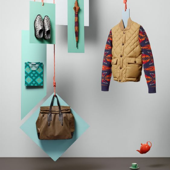
Tell a story by featuring a cluster of goods that will be great together, such as trousers, a shirt, a bag, shoes, an umbrella, perhaps a picnic rug and an unusual item that will grab attention e.g. a teapot and cup in a menswear window, used for contrast. IKEA shows scenes and stories very well by presenting a whole bedroom or kitchen scene to save you imagining. It’s all laid out for you to indulge in.

Lighting will set the mood in the premises, as will music. Bright lights are modern and casual while soft lighting is intimate, giving more ambience. Highlight merchandising with spotlights. Use dimmers and underlighting on shelves and steps. Choose the tempo and volume of your music to match visual elements and product in store. It sets the mood.
Let us not forget the power of smell. Seventy-five per cent of people’s emotions come from what they smell. A 40 per cent improvement in mood is experienced when people encounter a pleasant smell. Real estate agents are well aware of the enhanced appeal during a house inspection when there is fresh brewed coffee or baked bread smells.
Above all else, use imagination and creativity. Regardless of the type or size of business, create an atmosphere that puts the customer at ease. Adding inexpensive and personal touches can give a unique personality. Shopfronts are all about individuality and finding a niche to sit in. Be enticing and satisfying and remember to engage all senses. A computer can’t give you experiences but your creativity can.
Indre Kisonas – principal designer – iok design
indre@iokdesign.com.au
www.iokdesign.com.au


