January 17th, 2021Design with Indre
“Colour is a power which directly influences the soul” – Wassily Kandinsky
Kandinsky’s words cannot be truer. His highly colourful works ignited my passion for colour, abstract expression, art and sculpture. It is well known that colour affects the mind and body through its wavelengths and therefore moods and behaviour.
A major portion of my work with clients is colour consultation for the individual, family or business. As colour is an influencer, it is important to match the environment with the individual (or collective) for certain tasks and during certain periods of time. For instance, this year’s 2021 colour forecasts will reflect the events of 2020.
Every year Pantone and Dulux, as the major players, will release their colour forecasts for the following year. This year’s theme will reflect the stress of 2020, the unpredictability, fear and the change to working from home.
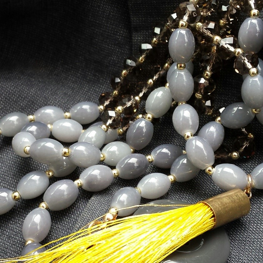
Pantone chose only two colours this time. Pantone 17-5104 Ultimate grey, being firm and dependable, as you would need after a year of unpredictability. The second is Pantone 13-0647 Illuminating yellow, representing strength and optimism as it is ‘bright and vivacious” (Dulux.com).
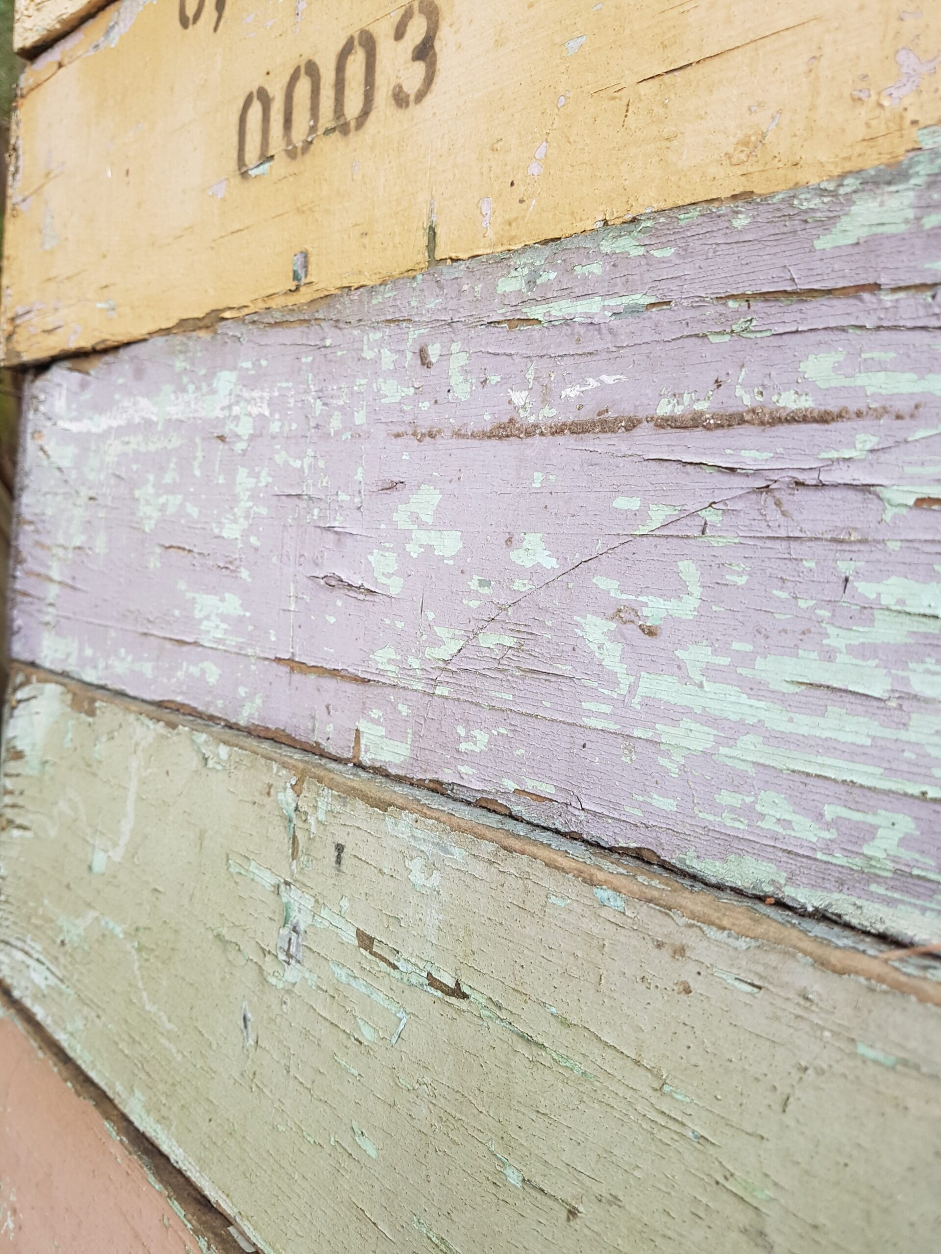
In my profession as interior designer, I love to be validated and my photo representing these two colours was Instagramed by me for the beginning of 2020. Same colours I am pleased to note and much earlier.
Dulux has a range they are calling Soothing “from three nurturing colour palettes that evoked retreat, nourish and reset”. (Dulux.com).
Everybody will have their own colour preferences that will make them comfortable this year. The easiest way the individual will express these choices is through their clothing choices. Already we are seeing much pink with uplifting colour choices for clothing. Sofas and manchester are using pinks and soft blues and greens. These colours are soothing and healing for the body and mind. Think sunrise over the bush or the beach. Soothing is needed after the year we all had.
Personally, my colours for 2021 are nourishingly rich and luxurious. Rich, luscious and lustrous equals richness and pleasure for the self. This is my mantra for this year. Be kind and generous with yourself. Find where and what makes you happy.
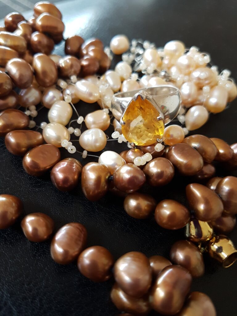
May we all find the colours that make us feel supported and nourished. Water pearls and a cognac citrine gemstone are my colour supports this year. May you also find your colour supports to assist through another challenging year. I don’t for a moment think the challenges from 2020 will miraculously come to a stop just because a calendar date changed to 2021.
Indre Kisonas owner and principal designer – iok design
indre@iokdesign.com.au | www.iokdesign.com.au